Year
2023
Client
Atlas
Industry
Wellbeing Product
Scope
Brand identity, Packaging
Design
Maciej Kupis
Atlas Hydration tackles the challenges of staying hydrated on-the-go, especially during travel when water intake is crucial yet often neglected. It also supports individuals in achieving their health and wellness goals by ensuring optimal hydration, which is a key component of overall health.
It’s like a health boost in a packet that you can take anywhere, whether you’re on a plane, playing outside, or just want to feel great.
With a strong vision and purpose in place, be++er design studio helped craft a meaningful brand that pushes the industry forward.
The name Atlas, derived from the Greek myth of the titan who bears the weight of the heavens, embodies strength, balance, and purity. This not only explains the brand’s essence but also laid the foundation for its hero illustration and packaging design.
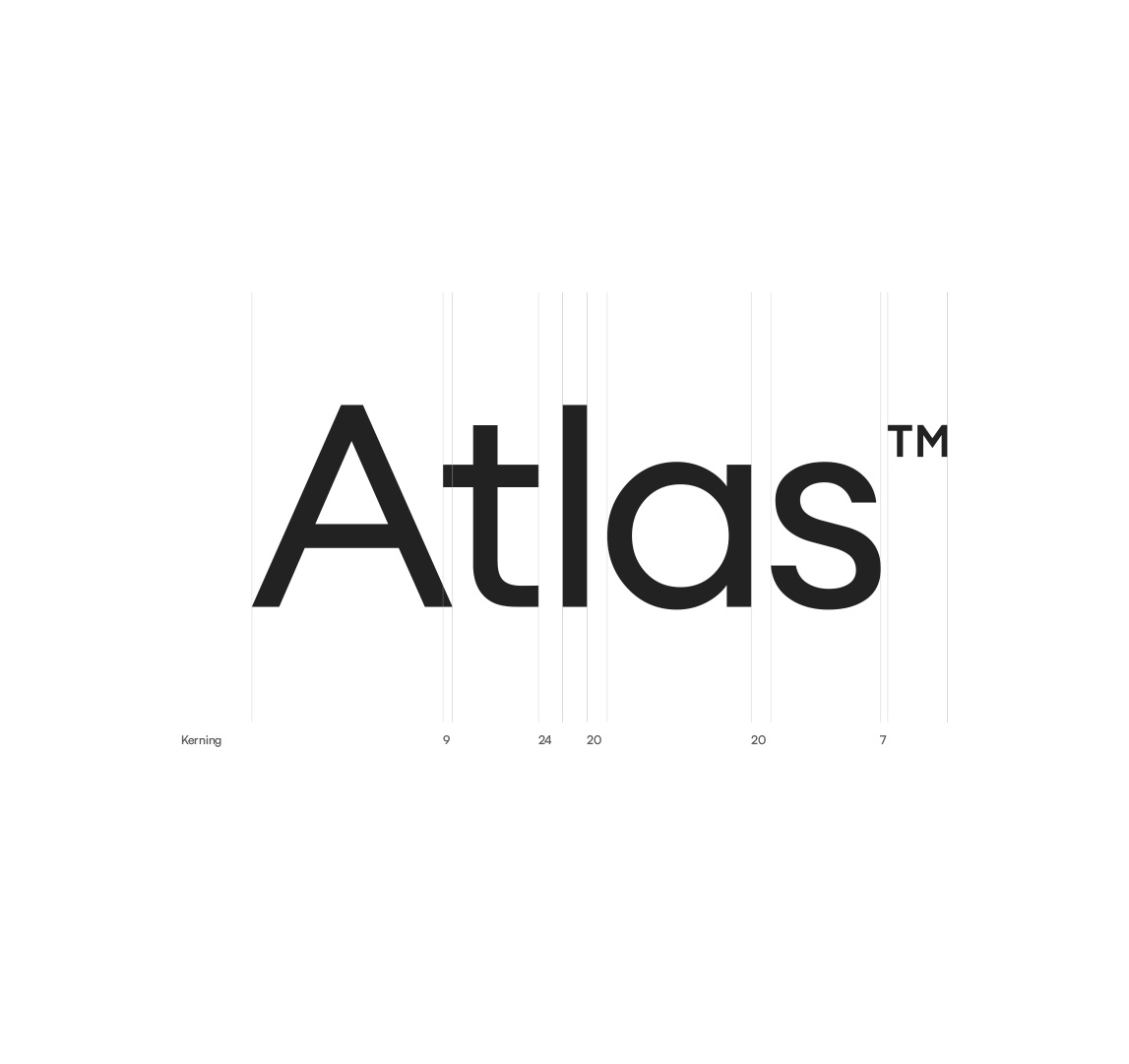
Atlas’ thoughtfully curated clean typography embodies its commitment to top-quality product formulation, relentless innovation, and a constant pursuit of advancements.
Carefully selected pastel colors reflect Atlas’ dedication to environmentally friendly practices with natural, healthy ingredients.
The overall tone and visual style were meticulously crafted to underpin Atlas’s commitment to health and dedication to quality.


Streamlining the design by removing unnecessary elements, while integrating the Atlas symbol, a symbol of power and balance, allowed us to create a brand that stands out with its purity and purpose.


And let’s change the world for be++er, together!
++
Working remotely with brands from around the world.